
Right then. The 50 greatest football shirts of all time. Not a simple list to compile by any means.
Of course, this sort of list leaves plenty of room for debate and there are guaranteed to be plenty of classics which have been missed out - but there's only room for 50 to make the cut.
The only rule that applies: One shirt per club or country.
So without further ado, let's get started.
50) Athletic Bilbao - 2011/12

Kicking off this list is a cracking effort from Umbro, who produced this striking away kit for Athletic Bilbao in 2011/12.
The green shirt featured a twin-stripe effect which drew inspiration from the
49) Chelsea - 2003/05

Less doesn't always necessarily mean more, but on this occasion it certainly does.
Chelsea famously sported this Umbro number on their way to their first ever Premier League title and it would be fair to say that it has stood the test of time. The simplistic design, complimented perfectly by smart white details, would be enough to make any Chelsea fan swoon.
48) West Ham - 1999/01

It's difficult to put a finger on what exactly made this work. Was it the carefully crafted Fila design? The Dr Martens sponsor? Or Paolo Di Canio?
West Ham sported their most iconic shirt at the dawn of the new millennium and it's unlikely anyone will ever be able to produce a Hammers kit quite like it ever again.
47) Paris Saint-Germain - 1995/96

Paris Saint-Germain caused quite the storm when they debuted the first kit to be produced by Jordan in 2018/19, but that doesn't hold a candle to their 1995/96 home effort.

Phwoar. Manchester City's 1993/95 home shirt may not be the most memorable in the club's history, but it's certainly their smartest.
The Gallagher brothers were clearly fans of the Umbro jersey, as they also elevated its cult status upon its release, bringing football shirts into the mainstream spotlight. Football is cool after all.

If you were one of the lucky ones to get your hands on Nigeria's 'Naija' shirt before the 2018 World Cup, then you were no doubt the envy of most of the world.
The shirt completely sold out on the Nike store minutes after it was released to the general public, exemplifying just how big an impact it made.
44) Kaizer Chiefs - 2011/12
Okay, this is admittedly a bit bonkers. But good bonkers.
Kaizer Chiefs' home kit for the 2011/12 season caused quite the stir as it effectively managed to infuse the club's badge into the design of the shirt - which is no easy task when the South African side's badge centrally features a Native American chief.
43) Rangers - 1987/90

There isn't too much room for significant change when it comes to Rangers shirts, but the 1987/90 kit was a very subtle departure from previous traditions.
What made this shirt stand out was the unique
42) Cameroon - 2002

Mental, controversial and downright brilliant. Cameroon's 2002 sleeveless home shirt was truly something to behold.
The
41) USA - 1992

USA have had some truly horrendous kits over the years - the 1994 faux-denim away shirt immediately springs to mind - but adidas got it right on this occasion.
The alternating blue and red stripes that were strapped across the shirt's shoulder added a suitably patriotic touch while ensuring that it remained impressively stylish. Saucy.
40) Japan - 1998

France '98 had some b-e-a-u-tiful kits on show, with Japan's home effort being one of the highlights.
The Blue Samurai made quite the impression at their debut tournament, but it wasn't because of their performances on the pitch. The flames imprinted on the sleeves made sure that this was an instant classic, even if there was no real explanation as to why they were there in the first place.
39) Tottenham - 1986/87

This is certainly the most adventurous Tottenham shirt of all time and, in this case, that's a good thing.
It's practically impossible for Hummel to make a kit that's anything less that stellar, even if that means taking a few risks along the way. Spurs' 1985-87 kit was made even more memorable after Diego Maradona wore it at
38) Club America - 1994/96

Okay, there's a lot to discuss here, as this is far from just a bog-standard adidas template.
Club America have a back-catalogue of wacky designs, but there's something about this one that just works. The contrasting colours that adorn the top-half of the shirt - coupled with the Coca-Cola sponsorship - combine together to create what can only be described as a football hipster's dream.
37) Croatia - 1998

Croatia's chess-board, or šahovnica,
We got to see plenty of the kit as well, as Croatia went all the way to the semi-finals in France, making everyone want to go out and cut up their nan's picnic blanket.
36) Roma - 1985/86

Yes, yes, yes. The first Serie A kit to feature on the list and, shock, it's an absolute corker.
Roma's iconic red and yellow shirt - which the club is named after - has been tinkered with to varying degrees of success over the years, but there's no beating the 1985/86 number. B
35) Jamaica - 1998

A bit of a marmite one this, but love it or hate it, there's no denying that Jamaica's 1998 World Cup shirt left a lasting impression.
The vibrant mishmash of colours and patterns mirrors the crazy journey the

New York Cosmos are more of a fashion brand than a club, but that's not a bad thing when they've gifted the world with kits as cool as this.
Italian sportswear brand Ellesse produced the shirt for Cosmos between 1981 and 1984, which featured a striking blue and yellow collar and nothing but a number on the torso in place of any sponsors.
33) Manchester United - 1994/95

Manchester United made a splash with an interesting lace-up design which still holds a place in supporters' hearts, but it was the follow-up kit from Umbro which really stole the show in the early nineties.
It was elegant, featured a superimposed graphic of Old Trafford and Eric Cantona was able to pull his collar up to his hearts content, which is always good.
32) France - 2011/12

*Controversy sirens*
France have had a plethora of classy shirts over the years, but none broke the boundaries quite like this away jersey. It took inspiration from
31) Saint-Etienne - 1976/77

Not many club sides wear green, which probably explains why Saint-Etienne are simply nicknamed as such. Les Vertes.
It's a classy looking shirt, with the emerald green contrasting against the French tricolour on the sleeve cuffs and, interestingly, it doesn't feature the club badge, instead opting to make the sponsor as big as possible. As strange as that might be, it seems to suit.
30) Hamburg - 1979/80

Hamburg may have dramatically fallen from the lofty heights of the Bundesliga in recent years, but there was once a time when they were one of the most feared teams in Europe.
The German outfit finished as runners-up in the league and European Cup in 197980 while wearing this tidy shirt, which was produced by adidas following their takeover of the now-defunct manufacturer Erima.
29) Palmeiras - 1990/91
#Palmeiras (1991) pic.twitter.com/30CIoJmvwN
— OldFootballPhotos (@OldFootball11) January 15, 2018
It's one of the more understated shirts on this list - particularly as it's not that well-known - but all the elements involved combine together perfectly.
The deep-green design was even stylish enough to be worn by Bob Marley, though his version of the shirt didn't feature the Coca-Cola branding, which is a real shame.
28 ) Sweden - 1992

England supporters won't thank me for saying this, but Sweden looked really good when they knocked the Three Lions out of the 1992 European Championships. I'm not talking about their style of football, though..
It's the classic adidas three-stripe template once again, but this was arguably the most striking of them all, as the yellow and blue combined to create a visually-stunning shirt.
27) Colombia - 1990

Forget the shirt for a second. Just look at the hair on show in this picture. Incredible stuff.
Anyway, back to what we are supposed to be talking about here - the shirt. And what a shirt it was. Deep red with a jazzy symmetrical pattern on both sleeves, it's a travesty Colombia never actually achieved anything during the early nineties.
26) Real Madrid - 1995/96

It seems strange to think of Real Madrid playing in a kit made by a little-known Spanish manufacturer, but that was the case during the mid-nineties.
Kelma produced a decent looking-shirt, which was improved no-end by the inclusion of their purple pawprint logo, which stretched across the length of the sleeves. Unique, sure, but it worked to great effect.
25) Liverpool - 1987/88

Liverpool supporters have been spoiled for choice over the years, as there haven't been many home shirts which have failed to hit the mark - the recent Warrior years aside.
This particular shirt is probably the pick of the bunch. The likes of Kenny Dalglish, Alan Hansen and John Barnes all strutted their stuff in the deep red number, which was incidentally the last to feature Crown Paints as the club's sponsor.
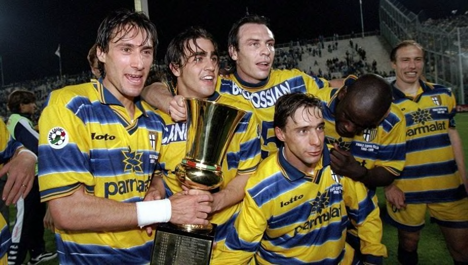
24) Parma - 1998/99

Parma hold a special place in the hearts of anyone who followed Italian football during the nineties and that's partly because they were always a stylish bunch.
The quintessential yellow and blue stripes were on show during Parma's historic 1998/99 season, where they secured the UEFA Cup and the Copa Italia in impressive fashion. All while looking as snazzy as can be.
23) Arsenal - 2005/06

Anniversary kits don't always work out as intended, but Arsenal's celebration of Highbury was executed to perfection. Or was it?
The reinterpretation was based off the kit that travelled with Arsenal to Highbury in 1913, but the picture that was used as a reference point was in black and white. We have no idea whether the 2006 shirt is accurate, but does it really matter when it looks as good as this?
22) Lazio - 1982/83
NEW BLOG !
— RB | Classic Soccer Jerseys (@classicsoccerjs) December 20, 2018
"1982: Ennerre Help Lazio Spread Their Wings" by @museumofjerseys
Read it here: https://t.co/Ll9xvW3wZO pic.twitter.com/NmP5LSN3IA
Lazio brought this long-forgotten design out of retirement in 2018, but the upgraded version doesn't hold a candle to the original.
There isn't really anything else like it. The club's eagle stretches across the width of the torso to separate the traditional blue and white colours and isn't interrupted by an intrusive sponsor, which makes you wonder why on earth it almost slipped into obscurity.
21) Peru - 1978

Peru's 1978 World Cup kit left an indelible mark on the world as the South American underdogs finished in the top eight for the second consecutive tournament.
Yes, River Plate and Rayo Vallecano also sport the same red stripe, but the simplicity and purity of the Peruvian shirt elevates it above the rest - this particular one being the smartest.
20) Marseille - 1990/91

Chris Waddle may have ended the 1990 World Cup in disaster, missing the decisive penalty for England against West Germany, but he went on to enjoy a hugely successful season with Marseille in, as you can see, one hell of a kit.
It's downright gorgeous. Simplistic, yet intricate, the Ligue 1 outfit's white home shirt goes down as the greatest French club shirt of all time.
19) Italy - 1982

Whether your lasting memory of Italy's 1982 World Cup win is Paolo Rossi's hat-trick against Brazil or Marco Tardelli's eye-bulging celebration against West Germany, everyone is aware of the famous Azzurri shirt.
We may not have remembered the shirt at all if it weren't for Italy's heroics, but it's now embedded in football history as one of the all-time greats.
18) Ajax - 1994/95

There isn't anything out there that quite matches Ajax's traditional white and red colours. After all, the Amsterdam club have been using the same template for over 100 years now.
There have been some memorable shirts over the years, but the standout has to be the Champions League-winning effort, which also featured vertical sponsorship - something which remains incredibly rare.
17) Mexico - 1998

Okay, so this is certainly out there, even by nineties' kit standards.
Mexico arrived at France '98 with a statement to make and, boy, did they make it. It was impossible to miss the Aztec-inspired design that adorned the front of the shirt and, although it's a little excessive, it's all the better for being utterly bonkers.
16) Juventus - 1985/86

No messing about here. This is not just a Juventus shirt. This is the Juventus shirt.
The black and white stripes feature, of course, but the plunging v-neck and huge collar make this shirt feel that little bit special. Juve supporters will be longing for a return to their roots when you consider how awful the 2019/20 kit is...
15) Inter - 1992/94

It was a toss up between the 1992 Inter home and away shirts for this spot on the list, but the home shirt *just* comes out on top.
The blue stripes are much lighter than tends to be tradition with Inter shirts, but it works splendidly alongside the Fiorucci sponsor - not the Milanese fashion brand, but a maker of fine Salamis. The more you know.
14) Boca Juniors - 1981
Boca Juniors team line-up 1981#BocaJuniors pic.twitter.com/1BdzxuMdWc
— Football Memories (@footballmemorys) July 31, 2017
The most recognisable shirt to come out of Argentina, Boca Juniors' blue and yellow is steeped in history and no one pulls off the colours like they do.
13) Sampdoria - 1990/92
Vialli and Mancini at #Sampdoria after 1991 #Scudetto win ⚽ #90sfootball #SerieA #throwback #Calcio #footballitalia #retro #CFS pic.twitter.com/mFWw0gWLqJ
— Domenico Brunetti (@domthered) September 10, 2017
There's nothing wrong with simplicity - this list has proven that ten times over - but some clubs don't do simple. Sampdoria are one such club. Blue shirts, accompanied by white, red and black stripes shouldn't work on paper, but they certainly do in practice.
There's nothing out there that's even remotely similar, which makes it all the more special.
12) Barcelona - 1974/75

It may be brave to vouch for a Barcelona away kit in this instance, but bear with me.
We all love a sash - see Peru - and this is the sash to beat all sashes, incorporating the home colours into the away shirt magnificently. It was a design that was well ahead of its time and had the added bonus of being worn by Johan Cruyff , which is always going to work in its favour.
11) Celtic 1966/67

Mmmm. Yeah. That'll do nicely Celtic.
The hoop design is synonymous with Celtic and it simply doesn't get better than the European Cup winning shirt of 1967. No logos, no sponsors and no frills, this is as real as it gets.
10) Newcastle - 1995/97

We arrive at the top ten with the greatest Premier League shirt of all time.
Newcastle's iconic black and white stripes? Check.
A timeless adidas design? Aye.
A Newcastle Brown Ale logo that's crying out for its long-awaited return? All present and correct.
9) England 1982

England fail miserably a lot of the time. But they'll be damned if they don't look flashy while doing so.
There's an abundance of classic kits which evoke painful memories of the past, but none match the Spain '82 number from Admiral which boldly integrated blue details into the primary design. Italia '90's third kit was a close second, mind you.
8) Fiorentina 1998/99

The greatest example of a sponsor doing all the work to make a shirt memorable, Fiorentina somehow managed to get Nintendo on board for their 1998/99 shirt. NINTENDO. Drink it in.
In fairness, that's probably unfair on the rest of the shirt, as it's one of La Viola's finest, even without the iconic sponsorship deal.
7) Milan - 1988/90

Milan were scarily good during the late eighties and early nineties. It helps that their black and red stripes were as intimidating as they were fashionable.
It doesn't matter who springs to mind when you think of Milan in this kit, I just know that you're picturing them lifting a trophy of some description.
6) Brazil - 1970
#OnThisDay 1970 the Brazilian national team became permanent owners of the Jules Rimet Trophy after winning the #FIFA World Cup for the third time.The Trophy was stolen in Rio de Janeiro, & has never to be seen again. Most agree 1970 was the best World Cup ever. #Brazil pic.twitter.com/uihCuwExfs
— Gavin Duffy (@GavinDuffy) June 21, 2019
Mexico '70 bore witness to the greatest team to ever play the beautiful game, sporting a kit which symbolises footballing perfection. Brazil.
This is the definitive kit of the definitive Brazilian side. Understated, slick and easy on the eye.
5) West Germany - 1988/91

West Germany romped to World Cup glory in 1990 and set the tone for a decade's worth of striking graphic designs - some far better than others.
The home shirt is universally considered to be one of the most innovative designs of all time, utilising the country's national colours to great effect. adidas knocked it out of the park with this one.
4) Napoli - 1989/90

If you stick Diego Maradona in just about anything then he'll make it look good. Stick him in a Napoli shirt like this and you've got yourself a winning combination.
It's also fun to learn that the shirts themselves, produced by Ennerre, were wide-fitting and short in length. It's almost as if they had a certain player in mind.
3) Netherlands - 1988

It's tough to leave out the 1974 offering from the Netherlands, but the cutting-edge design on show here means that it simply has to feature.
It was worn for just five games at the 1988 European Championships as the Netherlands secured their one and only major title, but that was enough time for it to achieve legendary status as one of the most stylish shirts of all time.
2) Argentina - 1986/87

Nothing about this shirt needs improving. Nothing.
Argentina's 1986 World Cup winning-shirt simply exudes perfection, with it's carefully-crafted design *fortunately* being matched by side worthy of lifting the biggest prize of them all.
1) Denmark 1986
1986 Group Stage: Goals from Preben Elkjær Larsen and Michael Laudrup help Denmark to a 6-1 win against Uruguay. pic.twitter.com/MZiB4me09G
— World Cup Photos (@WorldCupPhotos1) March 7, 2014
Source : 90min